Wednesday 1 February 2012

Introduction and evaluating the brief & final piece

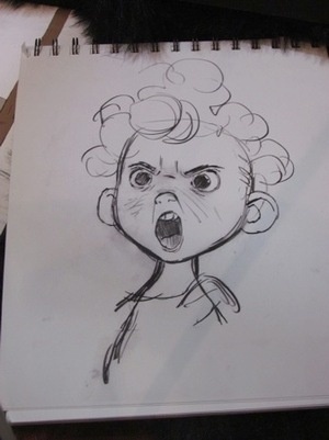
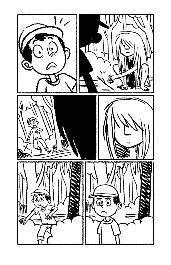
For Unit 4 of Graphic Communication, the brief was “combinations and alliances”, so first I explored a few ideas based on this theme through the medium of brainstorms.  At first I planned for my final piece to be a comic as I had done for my previous three units, particularly because I felt that such a medium fitted the theme well, since traditionally comics are a combination of pictures and words.  I studied various comic strips and did a few artist copies of the characters from them, especially to help develop my ideas with both the style I would use for my final piece, and the design of the characters that would be involved.  Although not long after this I decided to change my form and subject matter from comics to concept art and design for a fictitious film, it still aided me on the rest of my journey to my final piece.  The reason I changed from comics to concept art for a film was because I felt that changing the angle I was coming from would help bring fresh ideas to mind.   

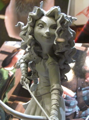
I studied such concept art as from various Pixar films, such as “Brave” and “The Incredibles”, as well as Dreamworks’ “How to Train Your Dragon”; one part of creating concept as evidenced by some of the concept art of “Brave” was to build a model of one of the main characters.  So, after creating some rough ink drawings of the designs I wanted the main characters of my ‘film’ to have, I created a model out of Plasticine of Blue, one of the leading roles, then drew some sketches based on the model.  This helped establish his design, as well as the pose he would have in the final piece itself.  

After some deliberation, I named the film “Epiphany”, wrote up a brief synopsis of the film, then decided to focus on the environments and scenery that might feature in the piece of concept art I planned to create for the final piece.  The concept art from “Brave”, “The Incredibles” and “How To Train Your Dragon” that I had been studying all contained not only character designs and separate setting designs, but also contained actual concepts of key scenes that would occur in the movie.  Taking inspiration from this, I decided that my final piece would be this kind of concept art: I decided that for my final piece, I would depict a key scene from “Epiphany”.  I chose to depict the scene where the characters from the fantasy world first meet with their author during their endeavours to form an alliance with her, which would occur in the “real” world in which the author lives.  

I established in the synopsis that “Epiphany” would have two parallel worlds as the main settings: one would be a magical, fantasy world, which I aimed to portray as natural and untouched by technology, and the contrasting “real” world (Earth), which would be portrayed as a much more industrial and artificial place without magic.  These starkly contrasting worlds collide when the fantasy world characters manage to create a portal combining their world with Earth.  Then I began to experiment through different mediums, including Photoshop, chalk pastels, and even paper cutting, how I could depict the setting and its atmosphere effectively.  I experimented not just with scenery, but with weather and time of day too, and through this discovered that a rainstorm at night was the most dramatic and suiting to the scene I wanted to create from “Epiphany”.  

Thanks to a recent trip to Edinburgh, I was inspired by the city and decided that while the “real” world in “Epiphany” would be shown as unnatural and industrialised, it could still be an environment beautiful in its own way; thus I decided to have the main location of the “real” world set in a beautiful, Edinburgh-esque city.  Realising that the scene from “Epiphany” I wanted to create would occur in the “real” world, I took photos I took of Edinburgh and, after studying them and taking note of what I wanted to include in the city environment of this piece of concept art, set out to pencil the mock-up for my final piece.  

For the actual exam, I drew and inked the concept art for “Epiphany” and scanned it into a computer and proceeded to colour the entire thing in Photoshop.  Although I had coloured in Photoshop before, I took a risk because it was the first time I had done a complete picture with full shading, as well as colouring the actual lines in a darker version of the colour of whatever they depicted (for example, Blue’s hair is blue so I coloured the lines depicting his hair a dark blue).  Previous experimentation in Photoshop allowed me to harbour new skills such as creating rain and a cloudy and starry sky effectively.  Applying these and other techniques I had learnt and developed truly helped the final piece come together in the closest way possible to how I imagined it. 

Tuesday 31 January 2012

Brainstorming


Examples of the Form - Concept Art

Here are some examples of concept art from CGI animated films by such studios as Pixar and Dreamworks, which I studied for help and inspiration for my final piece.  Such concept art ranges from models and sketches of character designs, to vast and detailed pieces of art of key scenes that will or may feature in the film. 

Concept Art from "Brave"


Concept Art from "How to Train Your Dragon"


Concept Art from "The Incredibles"


Monday 30 January 2012

Combinations of animals and humans - anthropomorphic animals (Sonic the Hedgehog)

The 'Sonic the Hedgehog' series has character designs that are good examples of animal features being combined with human ones.  I decided to study my favourite group of characters, known collectively as the Chaotix, and draw them.  These are the images (official art/character models) I referenced of the four characters, Vector the Crocodile, Mighty the Armadillo, Espio the Chameleon and Charmy Bee, who I drew; however, being familiar with the characters already, I found them relatively to draw:


Here are my drawings of them:


These drawings I them inked with a combination of India ink and fineliners:


Combinations of fictional animal qualities and human qualities; alliances between people and fictional animals (Pokemon!)


 My anthropomorphic Pokemon character with a friend's (their original artwork for their character can be seen here).
 Art for another online friend:

Sunday 29 January 2012

Comparisons Between Female Slice-of-Life comic artists

Melissa Mendes: examples of her work:


My artist's copy of Melissa Mendes's characters from "Where-wolf?":
A couple of sketches of character ideas in the style of Melissa Mendes:


Hope Larson: an example of her work from "Salamander Dreams":
My artist's copy:
Vera Bee: An example of her work from "What were you raised by wolves?":
My artist's copies and emulations of her style:


Comparison between works of Melissa Mendes, Hope Larson and Vera Bee

Melissa Mendes has a charming art style which verges on childlike in its simplicity and abandonment of accuracy in proportions or anatomy, and yet evidences a kind of control to her seemingly erratic and random use of brushstrokes that only truly skilled artists can achieve.  Her character designs, particularly her recurring character Freddy and the two protagonists of “Where-Wolf?”, ooze character and individuality.  In comparison, Vera Bee has a much more consistent art style, although her character designs are equally unique and appealing.  While, like Mendes’ work, Bee’s art style is quite minimalist, and also in-keeping with a child-like quality through the way her lines are crayon-like in texture, there is something much more mature and organised to Bee’s work.  On the other hand, Mendes applies a grey tone to her work, while Bee’s is purely black and white and representing shadow with child-like black squiggles. 
In contrast, Hope Larson has a style that is more mature than both Mendes and Bee’s works, not just in her actual style, but the way she uses brush and ink, giving her lines a dreamy, water-like flow.  Unlike the other two also, in her graphic novel “Salamander Dream”, she applies colour to her work rather than just monotone; just the one colour other than black and white is used, however: green.  This helps further the natural and dream-like quality to the art and the story, along with the abstract use of human biology incorporated into the story and artwork, for example when the two main characters hop from one giant blood cell to the next and float among DNA helixes, as well as the general use of random dotted or wiggly lines that sometimes appear in the background.  These can all easily be construed as visual metaphors to be interpreted by the reader, and gives the comic a deep, mature and meaningful impression. 
While it can be said that Mendes and Bee’s works do not hold quite as much spiritual deepness as Larson’s, it could be argued that it was not their intentions to be as such.  In addition, while the story of Bee’s “What were you raised by wolves?” is much more frank than “Salamander Dream” in its general presentation and includes an overall more cartoony and humorous atmosphere, it still holds a potent philosophical message to it that may leave the reader thinking, as well as twists in the plot that the reader may find unpredictable and emotionally stirring. 

Studying other artists and drawing their characters

As initially I was intending to do a comic for my final piece, I decided to focus on various comics and comic artists. Although I changed my direction by deciding to do concept art for my final piece instead, copying and emulating these characters and styles helped refine both the characters and styles I would use throughout the course of the rest of the unit, as well as the actual final piece itself. 


Here are a couple of pencil drawings of Maid from the Tom and Jerry comic.  She was very easy to draw, apart from those hideous legs and those crazy bread-roll feet (as you may be able to see from the rubber marks and sketchy lines that remain on my drawing). What is it with these cartoonists and having feet that look like bread rolls??


Study of Hägar the Horrible by Dik Browne


Here is a pencil drawing I did of Hägar the Horrible, his son, and a cow that appears in one of his comics.  I really enjoy Dik Browne's style, although I found it strange and even a little challenging at times to draw in it because of how few and choice lines are used to construct his characters. 


Here are the Hägar the Horrible comics that I referenced.


Dik Browne's style is simple but effective, and has the ability to utilise only a small amount of strokes to create appealing, larger-than-life characters.  He uses round curves and shapes which make the characters appear spongey, and uses open-ended lines for details such as hair.  He tends to render textures with hatching, a deceptively simple-looking technique that can actually sometimes be quite time-consuming to create, particularly when applied to more spacious areas of a drawing. The variety of colour Browne uses throughout the strip is minimal and sparing, giving the strip a recurring colour scheme; the use of dull greens, browns and burgundies, with splashes of yellow and blue for background colours; while this may be seen as dull or even simply as colour printing limitations of the 1970s and 80s, it arguably helps enforce the coarse and natural atmosphere of a Viking-era setting, as well as keeping the overall look of the comic consistent.

With these observations in mind, I attempted to create my own character in the style of Dik Browne as if it were a character from Hägar the Horrible. After quickly researching Viking names, I decided to choose the name Bolverk, as it sounded like it would suit the kind of character I wanted to create, and chose the alliterative "Brutal" as his designated Viking-esque adjective. 

Work-in-progress photo:


Here is the finished drawing of Bolverk the Brutal: